
Campaign List Redesign
How I leveraged user research to redesign one of the most impactful screens to satisfy the needs of our different target personas.
Click to enlarge
Project Description
The product team and I identified the user problems through feedback, user research, competitive research, and market research. We took the problems and turned them into goals for the project. See the full story about defining the users and problems - Platform Redesign Overview (password: bVKevZ@9b8).
The Problems & Goals
User Problems
Managers had difficulty organizing and managing their campaigns.
Analysts and strategic personas spent hours each day collecting campaign data.
To get the data for each campaign clients were tediously clicking one level further into each campaign to the campaign stats.
Campaign implementation personas spent extra time finding campaign details.
Strategic and implementation personas spent extra time finding campaigns, especially across channels.
Prospects didn’t trust the power because the UI in their opinion was outdated.
The Goals
Add better support for campaign organization
Expose campaign data
Make it easier to find campaigns
Make it easier to find campaign details
Improve the styles
Solve the problems in a way that works for each persona
My Role: Design lead, product design, user research & project management
Team: CTO (Product manager/head of product), UX Director, 20 engineers.
Tools: Axure, Google docs, GoToMeeting, Jira, whiteboard
Skills Demonstrated: Design thinking, user research, interaction design, visual design, collaboration, wire framing, leadership
Previous UI
Click to enlarge
New UI
Click to enlarge
Impact
An influx of positive client feedback reporting better ease of use.
Analysts and strategic personas noted that it took them less time to gather campaign data.
Completed my personal initiative of successfully involving the user throughout the whole process.
The Story
1. Feature Requirements
The first step was to define the feature, including the technical, business, and feature requirements, target users, common use cases, and questions. As the design lead, I created the feature doc that held this information and was responsible for the upkeep.
2. Understanding The Users’ Needs
There were some assumptions and user feedback about this screen, but we needed more of a direct and relevant understanding of how the clients were using this screen. I reviewed my previous research and then conducted user interviews. I had limited time to spend on the interviews so my primary focus was to validate we were solving the right problems and get a better understanding of how each persona was using the screen.
3. User Interviews
I conducted 6 user interviews over GoToMeeting with our top power users across industries and use cases. I worked with the CTO and Customer Success to select users, worked with the CS team and clients to schedule the calls, determined the goals of the study and method, moderated the sessions, analyzed the findings, and added the findings to the user, team, and company profiles for future projects and insights.
4. Applying Insights to the Designs
The user interviews provided valuable insights. I analyzed the data and applied what I learned to start designing the first iterations. The three main takeaways were as follows:
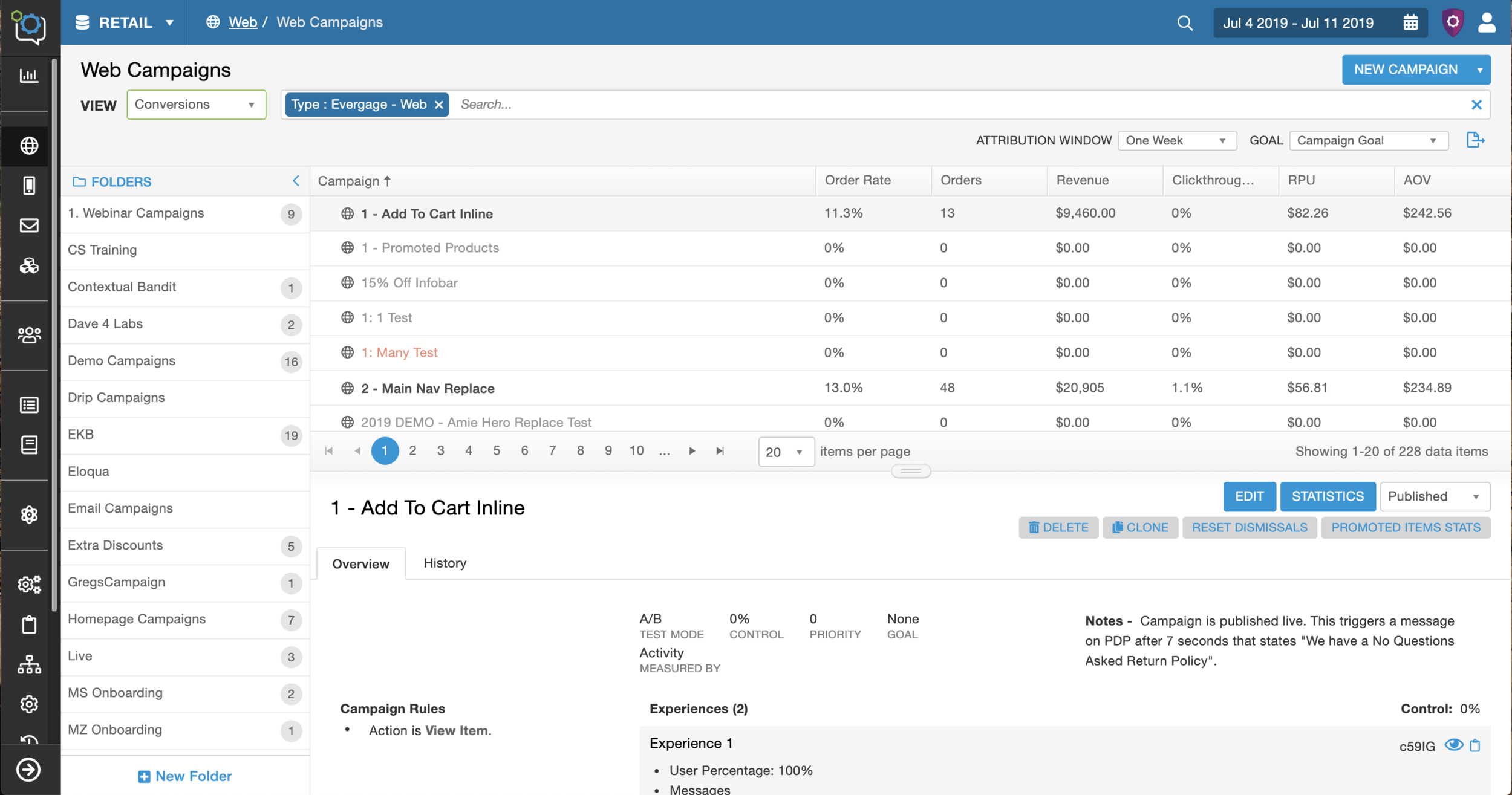
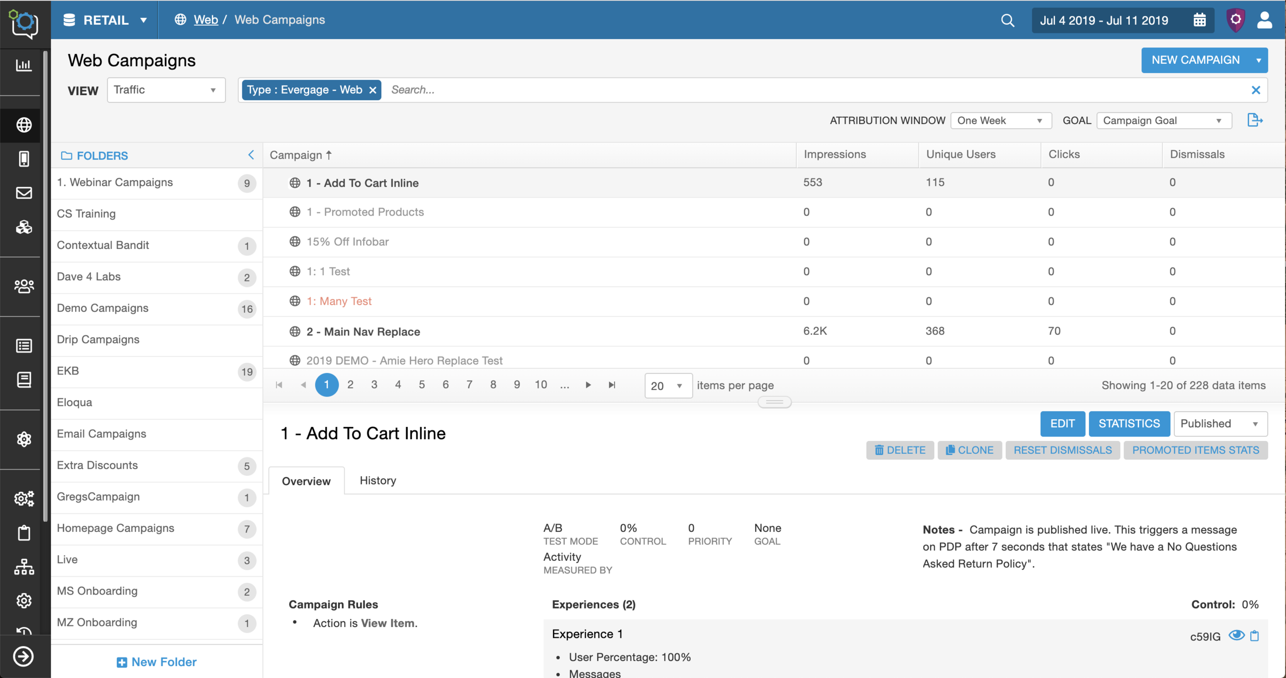
The strategic users confirmed that they needed more data.
The validation meant we would add more data in the columns. In order to add more data I created more space for the columns. To create this space we decided to create collapsible folders and moved the location and orientation of the details panel from the right side to the bottom.Validated the need for customization.
Each individual user, team, and organization had different responsibilities and goals. The implementation personas were focused on the campaign details and history, the strategic personas were focused on the data, and the strategic campaign builder was focused on both. The revenue tracking clients wanted revenue data and those that weren’t wanted conversion and clickthrough rates. This insight led me to look into solutions to customize the experience. I tried different solutions (explained below in design iterations)Strategy and organization ranged from team to team.
Some teams organized their campaigns based on the campaign builder, the type of promotion, the intent of the campaign, or the campaign status. The level of organization ranged from little organization to a flawless system. This variety led me to design a solution that included both subfolders and an additional tagging system to then test to see what resonated with the users.
5. Design Iterations
I created the first iterations of the screen in Axure RP. For the first iterations I cleaned up the columns to create as much space as possible. I started by making the screen customizable because it was critical for this screen to be effective for each persona since it’s a critical screen. I tried out two variations where the columns changed based on a toggle or sliding columns (outlined in red).
Context - This project was closely tied to another feature enhancement that involved the detail panel (covered). There are other artifacts from that feature mixed into this screen, for example the rocket ship icon.
6. Second Design Iteration
The two column options didn’t allow for enough flexibility and I needed to find a solution that allowed for more options. At that point I went back to the white board, researched similar UI structures, and looked for inspiration. I found inspiration from the concept of a custom workspace and custom boards found in Jira and YouTrack. The idea was to allow for multiple column options, we called “views,” by adding a drop down to the left that allowed the user to change the data in the columns based on their needs. The idea started out as the ability to be completely customizable. The next steps were to test that theory on the users.
I believed that creating views was the best solution to allow the different personas to achieve their goals on this screen. I presented my idea to the CTO and UX Director and leveraged the user insights to gain buy in and approval. The main hesitation was this would take double the engineering time to build, but the benefits I outlined outweighed the cost.
With the approval I moved forward with tackling the rest of the design goals. This included the following:
A robust search bar to help users find campaigns
Added more data, which included filters from the campaign statistics screen
Tags and subfolders
Callouts with more granular data
7. User Testing
There was a lot of new functionality and I wanted to see how the users would interact with the new designs, identify any problem areas, and understand what worked and what didn’t. I conducted 6 user tests over GoToMeeting with the same users who were interviewed at the start of the project. For the tests I created an interactive mockup in Axure and asked the participants to complete a few tasks, answer a few questions and then I left time for an open dialogue.
8. Applying Insights to the Designs
Overall, the tests went well. The two main takeaways were the following:
The clients were excited about the changes especially the views, search bar, and added data.
They told me how much the changes would improve their productivity. With the positive feedback on these features I moved forward with scoping the feature. I discussed technical restrictions with the CTO and made some changes. For the first version the views couldn’t be customizable, but we had decided to provide four built in options based on the user research. We also needed to limit the statistics filters to two and remove the added details on hover.There were mixed feelings about adding a tagging system.
Some clients were ecstatic about the tags, but some were very against them and said they would add unnecessary clutter. I considered this feedback in context of the rest of the project. We were making a ton of large changes and since people are generally reluctant to big change, I thought that adding a feature we knew would be negatively received wasn’t good. This could be added in the future after further investigation when we had more time to design the feature to really work.
Then I worked with the team to make the styles look cleaner, simpler, and more consistent.
Changed the folder and campaign list row styles from alternating white and gray to all white with a gray separating line.
Changed the row headers to a gray with a subtle gradient and made the folder header the same style.
Cleaned up spacing, including reducing the spacing between the icons and the edge of the row.
Updated the filter icon (black down arrow) on the campaign list columns to show an ellipsis icon on hover.
Changed the font from Arial to Helvetica.
The Final Designs
Click through the carousel to see the four different views. Each view changes the information in the columns.


9. Implementation
The engineers were closely involved in this redesign and were already building the framework as I was designing. The pass off was this final design iteration. We had weekly design meetings with the lead front-end engineer so we could address any issues or design challenges.
10. Beta Testing
This was a major change and I wanted to ensure the users were on board with the entire redesign. The change was released on a separate engineering server. Through 8 users tests, I was able to determine that this was a positive change overall.
Retrospective
By involving the user throughout the process, the team and I were able to create a positive and impactful change for the business, platform, and users.
Impact
An influx of positive client feedback reporting better ease of use.
Completed my personal initiative of successfully involving the user throughout the whole process.
Analysts and strategic personas noted that it took them less time to gather campaign data.
What Would I Do Next Time
More time spent on the user research to understand more about how the users were interacting with the screen. There was a ton of interactions that could have been optimized, like the search bar, detail panel, and the collapsible folder.
Customize the whole screen and not just the columns. There is opportunity to customize the detail panel and filter options which could further optimize efficiency for the different personas.
Involve the user throughout the process, this was crucial and I would make sure to do this again.